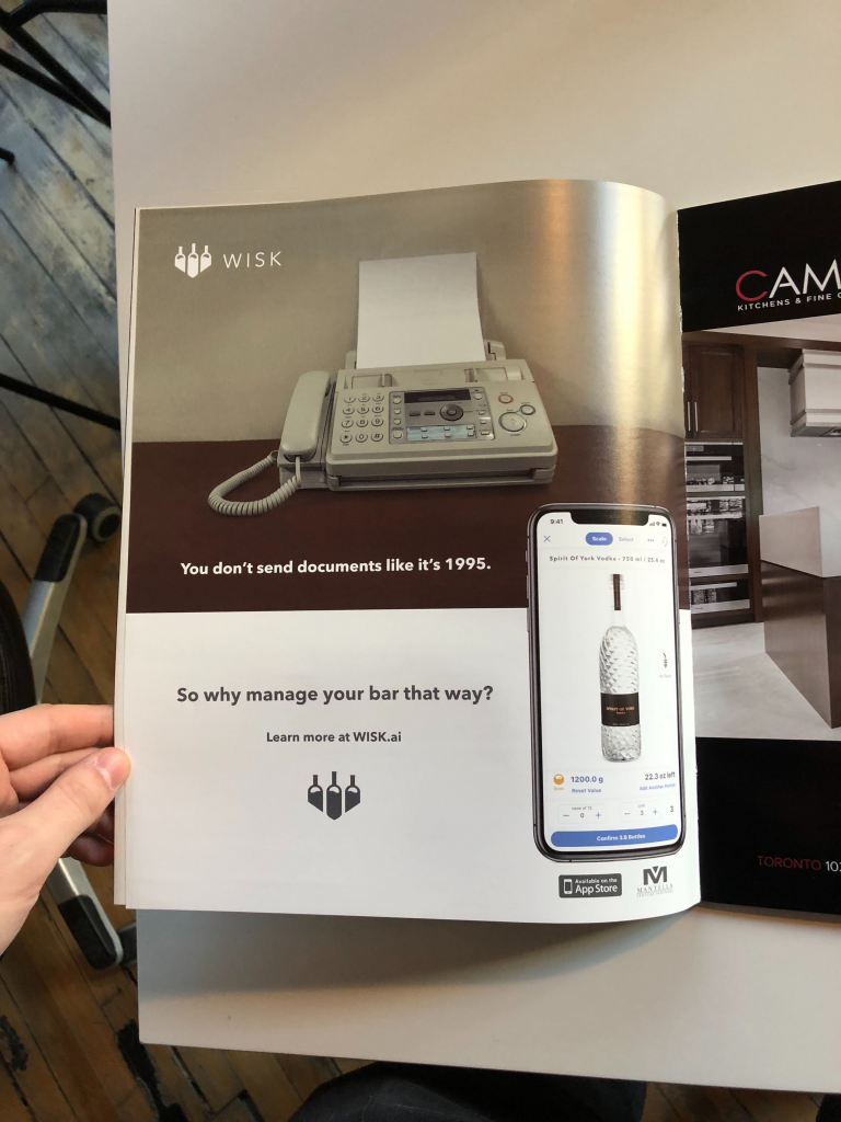
I set out to create a clear set of guidelines to create a cohesive style for Wisk. This came as a brand book that standardized a visual identity defining naming conventions, logo usage, colors, font and iconography.
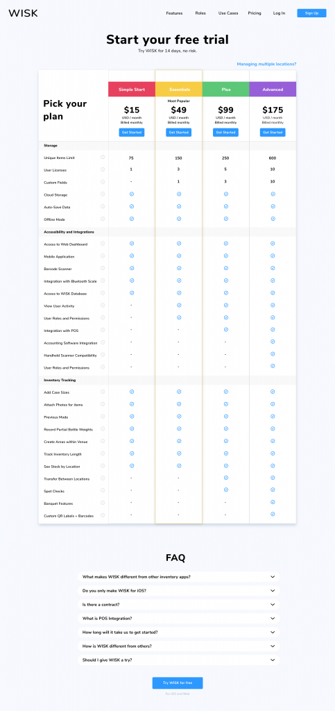
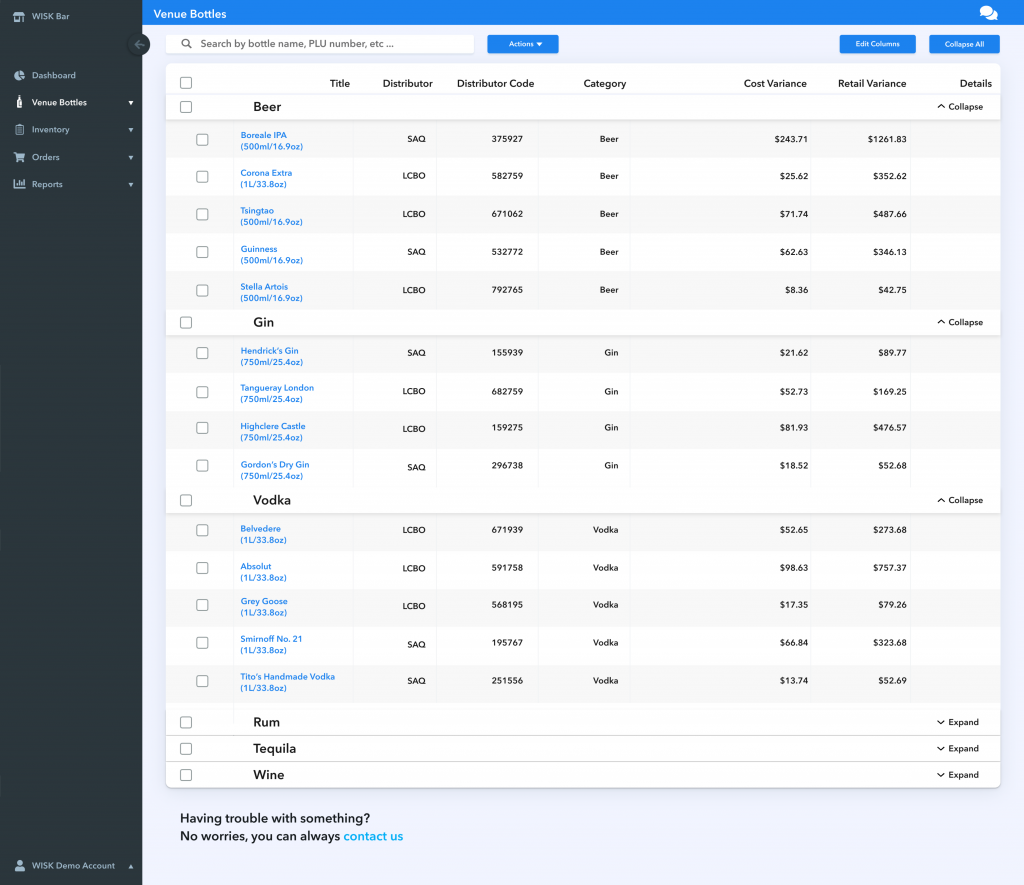
A style system of cards and drop-shadows laid the groundwork for Wisk’s information architecture, and hover effects made buttons feel like they were being physically pressed.